Building a Dashboard That Actually Matters

How I built a full QA monitoring system at Bayer — from the first stakeholder meeting to the final Power BI delivery.
If you think a data analyst’s job is just pulling data and making pretty charts, this project will give you a different perspective.
During my internship at Bayer as a Digitalization Intern, I had the opportunity to work on something far beyond visualization — I built a performance monitoring system from scratch, for a Quality Assurance team managing hundreds of pharmaceutical product batches every single day.
Step One: Sit Down, Listen, Understand
The first step wasn’t opening a laptop and writing code. The first step was a meeting.
I sat down with the QA team to understand what they actually needed. Not just “what kind of chart do you want,” but: What’s been hard to track? Where does information usually get lost? What decisions need to be made faster?
From that session, concrete needs emerged — they wanted to monitor Right First Time (RFT) rates, analysis time per category, sample testing volume, complaint costs, and corrective action logs (CAPA) — all in one place, with flexible filters.
This is what a lot of people overlook: a good dashboard starts with the right questions, not the right tools.
The Real Challenge: Data Was Everywhere
Once I knew what was needed, the next challenge was figuring out where the data lived.
QA data at Bayer was spread across three different sources:
SharePoint — for team operational data
Excel — for manual reports that had been running for years
CSV — for exports from internal systems
No single source was complete. Everything had to be brought together.
I carried out merge and append operations across tables from all these sources, making sure every row connected correctly — no duplicates, no missing data. All transformations were handled in Power Query before finally flowing into Power BI.
This part took the most time, and it was also the most critical. Because no matter how beautiful a dashboard looks, if the data underneath is wrong — every decision built on top of it is wrong too.

Presenting the final dashboard to Bayer’s team.
The Result: One Dashboard, Many Answers
The dashboard that came out of this process wasn’t just a collection of numbers. It was designed to answer the specific questions the QA team faces every day:
What’s the RFT rate this month for Formulation vs Finished Good products?
Which category has the longest average analysis time?
Which month saw a spike in complaint costs, and why?
Which CAPA items are resolved, and which ones are still open?
All answerable in seconds — with dynamic filters by product, plant, material, month, and year.
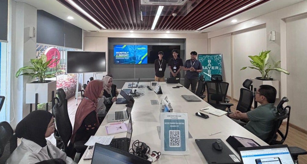
Presentation and review session with stakeholders.
What I Took Away
This project taught me that the value of a data analyst isn’t just technical skill — it’s the ability to translate business needs into data solutions that actually get used.
I learned that:
Requirement gathering is a skill. Listening actively and asking the right questions is the foundation of any successful data project.
Data integration is often more complex than the visualization. Most of my time was spent in the pipeline, not in the charts.
Delivery isn’t the end of the work. A great dashboard is one the team actually wants to use — not the most technically sophisticated one.
If you’re a recruiter or professional looking for someone who can handle data end-to-end — from stakeholder conversations to a production-ready dashboard — I’d love to connect.
📎 Check out my LinkedIn profile for more projects.
Written by Dafa Fajar Bagaskara — Digitalization Intern at Bayer | Data Analyst